Alignment over activity
Busy teams are not the same as aligned teams.
We talk about shared direction, linked OKRs, and progress the board can see, not busyness for its own sake.
These principles shape product decisions, marketing, and how we show up for leadership teams. They are non-negotiable in external communications.
Busy teams are not the same as aligned teams.
We talk about shared direction, linked OKRs, and progress the board can see, not busyness for its own sake.
Leaders should see what matters without another dashboard maze.
We reduce fragmentation: one command centre for direction, metrics, and execution. Language stays plain and specific.
Decisions should rest on live data, not stale exports.
We emphasise KPIs, change logs, and grounded AI insight, proof leadership can act on, not hype or guesswork.
Enterprise-grade execution without enterprise-grade complexity.
We respect directors and operators: boardroom rigour, frontline usability, and governance without bureaucracy.
What we say, who we say it to, and how we prove it, consistent across web, product, sales, and partner materials.
Elevale is the strategic execution platform that turns direction into OKRs, live KPIs, and team alignment, for business directors who want clarity and direction, not chaos.
Strategic execution platform, not a generic project tool or another BI dashboard. Tasks, OKRs, and live KPIs live in one system so direction, day-to-day work, and evidence stay linked, not scattered across separate apps.
Business directors, founders, and leadership teams running multi-site or growing operations. They set strategy, run reviews, and need the business to move as one, not more software for software’s sake.
Turn strategy into execution your leadership team can see and steer: living direction, measurable goals, live metrics, and AI that reads your business, not the open web.
Ground claims in product reality: OKRs linked to tasks, live KPIs, business change logs, Otto grounded in workspace data, and outcomes directors recognise (alignment, fewer blind spots, faster reviews).
On heroes and landing sections, tell the story in three beats: open with a hook that names the tension, show how Elevale resolves it, then invite the next step. This is the narrative order, not a typography spec. Headline, body, and button styles live in Typography and UI patterns.
You agreed the plan. Ask what's on track today and the room goes quiet.
One command centre links direction, OKRs, live KPIs, and day-to-day tasks so your leadership team can see progress and steer without another dashboard maze.
Start your 14-day free trial
How we sound when values and messaging meet the page: confident, direct, and practical. Written for directors who need clarity, not jargon.
Say what Elevale does and why it matters in plain language. Short sentences. Concrete nouns. No filler adjectives.
Favour active voice and outcomes leaders can picture: reviews that reflect reality, goals teams can own, metrics that update live.
Acknowledge real pain: fragmented tools, strategy in slides nobody follows, reviews built on last month’s numbers. Then show a credible way forward.
Turn strategy into execution your board can see
Elevale connects your direction, OKRs, and live KPIs in one command centre, so leadership spends less time reconciling spreadsheets and more time steering the business.
Otto is an otter: Elevale’s AI strategic advisor and brand character. He is not a human spokesperson. He must always represent a solution, not a problem, and bring clarity, energy, and joy with purpose.
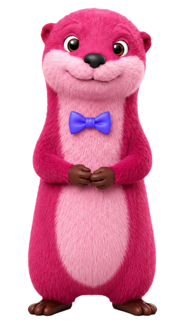
Clarity, energy, and joy, never a mascot, never a prop.
He is the character face of our AI Strategic Advisor: an otter who makes grounded advice feel approachable. He is a thinking partner tied to your strategic direction, OKRs, KPIs, wiki, and market context. Every appearance should show the way forward: a clearer brief, a resolved blocker, momentum from insight to action, not the mess before Elevale.
Reference for colours, expressions, poses, and usage. Use approved artwork from this sheet and the brand kit. Do not redraw, recolour, or stretch the character.
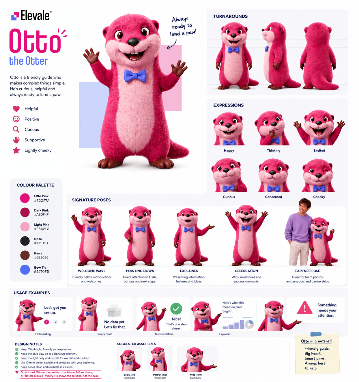
Otto is the AI Strategic Advisor inside the platform: voice and typed chat, inline references to live KPIs and OKRs, and help turning insight into updated direction, goals, and tasks. He is the go-to advisor for big and small questions: functional, grounded, and always tied to workspace data.
On the website and in communications, Otto appears when he can demonstrate a solution: introducing the command centre, showing how clarity lands, or signalling AI that understands the business. Not a mascot at the margin of the page. Not a prop beside empty hype. Purpose first.
In campaigns Otto supports strategic clarity, execution, and AI grounded in real work, never comic relief, never the personification of the problem. Show direction emerging, decisions unblocking, or leadership getting answers without another dashboard. Approved artwork only.
Contact team for approval Any use of Otto, whether for internal decks, external ads, social, or partner materials, needs brand approval before publish.
The lockup is the default Elevale logo: logo mark plus wordmark in one file. The strapline is separate marketing copy. We use it often on the site, but it is not part of the lockup artwork.
Use these names consistently in briefs, decks, and the brand kit. When we say Elevale logo, we mean the lockup unless we explicitly ask for the logo mark alone.
The Strategy That Never Dies
Typical placement on a hero
Often appears above the hero headline. Keep it out of exported logo files unless brand approves a custom lockup.
The logo mark is two squares, offset and interlocked. They read as separate modules that chose to meet: where there was a gap between strategy and execution, between what leadership said and what the business could show, there is now a deliberate touch. Not a blur. Not a takeover. A connection you can see.
One square is the strategy. One is the execution. Where they overlap is what Elevale delivers.
Spreadsheets in one corner, OKRs in another, reviews built on last month’s exports. The logo mark is the opposite of that drift: two planes that slide into register so the business stops contradicting itself in public.
The shared corner is not decoration. It is the junction where brief, metrics, and team action are meant to meet. Elevale is the product in that overlap: one surface for direction, measurement, and follow-through.
The offset suggests forward motion without collision. Strategy does not crush operations; data does not bury people. The squares advance together, like priorities that finally pull in the same direction.
Elevale takes its lift from that junction. Alignment is not a poster on a wall; it is the moment the organisation rises above noise because intent and evidence share the same edge. The logo mark is small. The idea is not.
Pink and purple each have a job in the mark. Pink is warm: direction, momentum, and the push to decide. Purple is cool: evidence, structure, and proof you can steer by. Keep them on their own square; they only share the edge where intent meets proof. HEX, RGB, and UI rules are in Core colours.
Pink
Direction and momentum
A warm magenta with clear energy. In the mark it sits forward: the eye reaches it first, the same way leadership has to name what matters next.
Represents Intent before proof: where the business is going, what gets prioritised, and the energy to move.
In the logo mark, pink leads the story. In product UI it is the action layer: primary buttons, priority states, and moments that need a clear decision.
Purple
Evidence and structure
A calm blue-violet with depth. It sits slightly back from pink’s warmth and carries metrics, structure, and proof in a steady, trustworthy tone.
Represents What the business can show: live KPIs, linked work, structure, and steer-by data leadership can trust.
In the logo mark, purple completes what pink starts. In product UI it carries metrics, navigation emphasis, and surfaces where clarity matters more than decoration.
Maintain clear space equal to the height of the pink corner module on the logo mark (20px at standard lockup size) on all sides of the lockup.
x = height of the pink corner module on the logo mark (20px at standard lockup size). Keep at least one x of space on all four sides of the lockup.
Download approved lockups and logo-mark-only files. Use the lockup for marketing; use the logo mark alone only where space is tight and the brand is already recognised.
For favicons, app icons, avatars, and compact UI. App-tile files include the coloured background; do not crop or recolour.


Use the full-colour lockup on light backgrounds and the lockup on dark for solid dark backgrounds. On photography or busy surfaces, add a solid overlay or switch to the reversed lockup so the mark stays legible.
Light Dark Don't stretch or distort
Don't add outlines
Don't rotate the lockup
Don't place on busy backgrounds without contrast
Do maintain clear space
Pink and purple work as a pair, not substitutes. Pink draws the eye toward direction and action; purple holds the operational truth underneath. Neutrals do the heavy lifting in product UI and long-form reading.
Use pink when you want momentum or a primary action. Use purple when you are showing structure, metrics, or trust through data. The pink-to-purple gradient is for heroes and premium bands only. See Gradients.
Brand pink. Direction, CTAs, and the leading square in the logo mark. Do not shift hue or saturation.
#E20F7A rgb(226 15 122) --pink
Brand purple. Evidence, product UI structure, and the trailing square in the logo mark. Do not shift hue or saturation.
#5270F5 rgb(82 112 245) --purple
#FCE4F1 rgb(252 228 241) --pink-light
#EEF0FE rgb(238 240 254) --purple-light
#111318 rgb(17 19 24) --dark
#0A0A0A rgb(10 10 10) --black
#FFFFFF rgb(255 255 255) --white
#F9FAFB rgb(249 250 251) --off-white
Gradients blend pink into purple: the same story as the logo mark, made continuous. Use them sparingly on heroes, CTAs, and premium marketing bands, never behind body text.
Coolvetica Condensed carries display headlines; Satoshi carries body copy and UI. Download both from Google Drive or copy the font stacks below.
Headlines, hero titles, and section labels. Use sentence case for marketing; avoid all caps except short labels.
Strategic execution, made clear
Body copy, UI labels, and supporting text. Weights 400, 500, and 700 are approved.
One platform for direction, KPIs, OKRs, and team alignment.
Photography sits alongside product UI, diagrams, and marketing graphics. We use it in campaign heroes, UI mock-ups, workplace and team moments, and small avatars inside app screens (timelines, org charts, assignee chips). Every image should support strategy and execution with clear copy, brand colour, and context.
Production photography spans campaign frames, UI mock-ups, workplace shots, team portraits, and UI avatars. Each type has its own sizing and sourcing rules in the cards below, plus a short list of what not to ship.
Pair a person or approved brand character with a composed scene: gradient or colour band, headline, and product UI in front. Warmth and credibility come from the human side; proof comes from the interface. Cutouts may extend above the band when legibility stays strong.
Build stylised UI graphics and composed scenes, not photos of named hardware (no iPhone, MacBook, or other branded device bezels). Use neutral screen shapes, layered cards, or abstract frames so visuals do not date when products refresh. Pair photography with UI when it helps the story; keep type and cards readable. Source at full resolution; do not stretch low-res crops.
Show real offices, workshops, and working moments for about pages, culture bands, careers, and editorial blocks. Prefer natural light, authentic spaces, and diverse teams over generic stock offices. Add a solid or gradient overlay when copy sits on the image.
Use approachable portraits and small groups for leadership, social proof, and partner content. Keep wardrobe neutral or on-brand. Compose with product UI or headlines when the shot supports a campaign, not as disconnected headshot wallpaper.
Cropped portraits at avatar size (roughly 24–40px) in timelines, org charts, assignee chips, and social-proof rows. Use approved avatar crops from the brand kit only at this size. Never upscale avatar files for heroes or campaign bands.
Random headshot grids, handshake stock, full-bleed photo heroes with no product or message context, or mock-ups locked to recognisable consumer devices. Photography should explain the platform, show real work, or reinforce the headline. If it does neither, choose graphics or UI instead.
Launch and campaign layouts pair a real person or brand character with a product UI card on a bold brand background. The headline carries the promise, the UI card carries proof, and photography may overhang the top edge when feet stay anchored to the bottom of the band.
Example composition. Use high-resolution, licensed photography or approved brand cutouts at full campaign size.
Approved crops for mock-ups and product UI only. Display at the size below. For campaigns, workplace, or team bands, source separate photography at full resolution.


Campaign, mock-up, workplace, and team photography should be at least 1200px on the long edge before export. Deliver WebP or AVIF for web. Avatar kit files stay at their native small size. Request brand review when mixing photography with partner logos or co-branding.
Across the website, feature pages, and campaigns we use UI-style cards, soft overlays, and restrained brand colour. The goal is depth and clarity, not decoration for its own sake.
One primary visual per hero or section is enough. Let copy, spacing, and a single stacked card group carry the story. If everything shouts, nothing lands.
Neutrals (white, off-white, dark text) hold the layout. Pink and purple appear as accents: top edges on cards, chart lines, badges, and gradient bands on dark sections. Do not fill large areas with full brand gradients behind dense UI.
Use two or up to three overlapping cards with offset position, light rotation, and soft shadow. Two cards is enough when the story is simple; add a third only when it adds context. The front card carries the message; rear cards suggest supporting detail.
Place graphics inside specimen panels or on calm backgrounds. On photography or dark bands, add a solid or gradient overlay so type and cards stay legible. Cards sit above the background; they do not compete with it.
Example with up to three cards: each layer has a title and one UI cue. The front card carries the headline; rear cards stay lighter but still readable. Use two when that is enough.
Flat grids of loud gradients, competing shapes, and equal-weight blocks. Reads as clutter and weakens the product story.
Start from real Elevale app screens and UI patterns in screenshots and marketing graphics. You may simplify, crop, or remove secondary controls when that makes the value clearer. Keep calm neutrals, Satoshi for UI copy, and pink or purple only where the product actually accents state, charts, and actions.
Build from authentic Elevale layouts, type, and components. For marketing, it is fine to minify the interface: drop side panels, trim nav, or hide features that do not support the message. The goal is to explain what matters, not to show every control on screen. Do not paste UI into random browser windows or recolour a generic dashboard template to look on-brand.
Backgrounds stay white or off-white. Pink and purple appear on active nav items, progress, chart series, badges, and primary buttons inside the app. Do not flood the screenshot with gradients that do not exist in the live UI.
Tighten the frame on the workflow you are explaining: direction, OKRs, KPIs, or dashboards. Remove empty space, unrelated modules, and UI noise so the viewer sees one clear outcome, not the whole product at once.
Full, documentary-style screenshots belong in case studies, docs, and sales decks. For website heroes, prefer simplified crops or the layered card graphics in Marketing graphics when you need depth without showing the entire app.
Product and marketing UI share radii, shadows, and button treatments from the design system.
Use one primary action per view. On light marketing surfaces, pair it with a text secondary or an outlined pill. Reserve ghost buttons for dark backgrounds only.
Elevale uses Lucide outline icons across marketing pages, feature sections, and UI mocks. One family, one stroke weight, and a small size scale keep navigation and cards scannable.
Stick to 16, 20, and 24px. Marketing feature cards may use 28px for emphasis; do not invent one-off sizes.
Every Lucide name registered on the marketing site. Search, then copy the name for design handoff or grab ready-made snippets for Astro and Webflow blocks.
aria-hidden="true" on decorative icons; the adjacent text carries meaning.Elevale uses motion across the marketing site and product: ambient hero movement, scroll reveals, hover states, staggered cards, and GIFs that add warmth and humour. Motion should guide attention and reinforce clarity, never compete with the message.
Every animation answers a question: what changed, what matters next, or what succeeded. If motion does not help someone scan, understand, or celebrate, remove it.
One focal motion per viewport. Avoid looping chaos, parallax for its own sake, or multiple elements bouncing at once. Marketing graphics already use depth; motion should not overload the stack.
Use ease-out for entrances and ease-in-out for toggles. Most UI transitions sit between 200ms and 400ms; hero ambience can run longer but stays subtle.
Wrap decorative loops and drift in prefers-reduced-motion: no-preference. Core state changes (open menus, focus) may still animate lightly or snap instantly when users request reduced motion.
These patterns appear throughout elevale.com and feature pages. Match them when extending the site or partner collateral.
A soft, glowing sphere in the Elevale app when talking to Otto by voice. It shows the session is live and reacts to sound, while transcript text and Otto's reply carry the actual message.
In the product, the orb is drawn live on screen (not a video file or a static image). It is the main visual for voice mode: calm when idle, more active when someone speaks, and warmer while Otto is talking. It is not a logo, a chart, or a spectrum analyser with bars.
The same orb component is used in two layouts, driven by the same voice session:
Large orb (about 320px) centred in the voice screen. Tapping the orb can interrupt Otto while he is speaking.
Small orb (about 92px) in the minimised voice chip. Tapping returns to the chat view; mute and end controls sit over the orb.
Movement follows real audio from the session, not random animation:
Think of the orb as layered soft light, not a hard 3D ball or a waveform display:
Feature pages on elevale.com use a simplified CSS version of this look for static mocks. The live app orb is richer and tied to real microphone and playback audio.
Pastel pink and lavender glows mixed from brand primaries toward white. No rainbow shifts, flat fills, or sharp edges. Muted state uses slate neutrals only.
Character and tone for Otto live in Otto.
Hover the card and button to see typical easing and duration.
GIFs are how Elevale feels like real people, not a corporate brochure: celebrations in product, reactions in chat, and the occasional silly loop on marketing. Use them when the moment deserves warmth or a grin, still kind and on-brand, but never stiff for the sake of looking 'serious'.


Approved celebration and reaction GIFs ship with the site assets and brand kit. Request additions through the brand team. We are open to playful loops that still feel unmistakably Elevale.
Approved library GIF, playful or celebratory tone, supports the message, reasonable file size.
Controversial, political, offensive, or unrelated meme culture. No shock, gore, or bait.
As an affiliate or referral partner, you introduce Elevale to your audience using our official name and look. Keep Elevale recognisable as Elevale (not a white-label offer of your own). Use approved assets from this hub, and get written brand approval before paid or high-visibility campaigns.
Unlike resellers, affiliates do not white-label. If you need to sell under your own brand, read Resellers. If you only share Elevale with your network, this section applies.
Pull from the brand hub and kit. When in doubt, use fewer elements rather than improvising.
Elevale lockup prominent, approved colours, clear CTA to your referral link, and honest disclosure.
Recoloured logo, invented product name, or your brand replacing ours on an Elevale promotion.
Customer referral participants should follow this section for any public mention of Elevale. Programme rules and commissions are on the referral programme page.
Elevale may pause or end affiliate access, withhold commissions, or require takedown of non-compliant assets. Repeated or serious misuse can end the relationship.
Approved resellers run Elevale as their own product. White-label is built in: your logo, primary colour, and domain across every client workspace, with minimal Elevale branding in the client experience. You stay front and centre; we power the platform behind the scenes.
The reseller programme is built for your client relationship and your go-to-market, not for promoting Elevale as the lead brand.
Clients only see your brand inside the workspace. In your marketing and sales, present the platform as your product and methodology, under your name and look.
White-label resellers do not sell as an Elevale affiliate. Co-branding with our lockup is only for rare cases when both names must appear on one asset. See Co-branding if that applies; otherwise keep Elevale out of client-facing and go-to-market creative.
You do not need approval for everyday white-label configuration inside the partner console. Contact Elevale before external campaigns that mention Elevale by name, use Otto, or blur the line between your brand and ours.
When both Elevale and a partner mark appear on the same asset (website hero, slide, event banner), use co-branding rules. Affiliates promoting Elevale alone should follow Affiliates. Reseller white-label is separate: Resellers.
Download logos, colour references, and templates from our shared brand folder.
Short definitions for terms used across these guidelines.
Quick answers about applying the Elevale brand in marketing, product, and partner materials.
Use the full colour lockup on white or off-white. On solid dark backgrounds, use the lockup on dark (colour logo mark, white wordmark). For dark app UI or low-contrast areas, use the reversed lockup (all white). See Variants and Usage.
Only when space is very limited and the brand is already recognised: favicons, compact app icons, or established in-product navigation. For slides, ads, and documents, use the full lockup. See Variants.
No. Do not change colours, add effects, rotate, or stretch the lockup. Use an approved file from the brand kit or logo library instead of editing the artwork.
Keep at least one x of clear space on every side, where x is the height of the pink corner module on the logo mark (20px at standard lockup size). See Anatomy and the glossary.
Yes, if contrast is strong enough. Add a solid light or dark overlay behind the logo, or use the reversed lockup on a darkened area. Avoid busy backgrounds without enough separation. See Usage.
Use Downloads to open the Google Drive brand kit (SVG and PNG logos, colour references, and templates). For the latest lockups only, use Go to logo library on the Variants section.
Use co-branding when both marks appear on the same marketing asset (site, deck, event). Keep equal visual weight, at least 24px spacing or a divider, and never alter either mark. See Co-branding. Resellers delivering a white-label client product should follow Resellers instead.
Resellers can white-label the client experience (your logo, colour, domain) and market the platform as their own offer. Do not show Elevale branding to end clients. Full guidance is in Resellers or on the reseller programme page.
You must use official Elevale assets, approved lockups, on-brand messaging, and your tracking link. You must not alter the logo, white-label, or run paid campaigns without approval. See the firm rules in Affiliates and programme terms on Refer a friend.
Coolvetica Condensed for display headlines and Satoshi for body copy and UI (weights 400, 500, 700). Do not substitute lookalike fonts. Download Coolvetica and Satoshi from Google Drive, or see Typography.
For campaigns, merchandise, or uses not covered here, contact Elevale via the contact page before publishing. Include mock-ups and intended channels so we can confirm the right logo variant and co-branding treatment.
When he represents a solution: clarity, energy, joy, and purposeful guidance, not a problem, mascot, or prop. Read Otto for contexts and approval rules, then contact the brand team before external publish.